MATH 140: Data Visualization with ggplot
Introduction
We can produce graphics in base R, as demonstrated in the data and descriptive statistics page.
We can also produce superb graphics using the powerful package ggplot2. We focus here on producing the following types of plots:
- histograms
- scatter plots
- box plots, and
- bar plots
I encourage you to replicate all the plots in this tutorial in your own RStudio session.
The ggplot2 package is part of the tidyverse package, so begin your session by loading the tidyverse. Recall, to do this, run the line
library(tidyverse)With the tidyverse loaded, you are ready to use the ggplot commands for generating plots.
All the plots in this tutorial use the earthquakes
data set that comes with the openintro package from our
text. This data frame contains information about all major 20th century
earthquakes.
If you have installed the openintro package, and loaded
it into your session, run this line
df <- earthquakesAlternatively, you can load the data frame into your session directly from its url:
df <- read.csv("https://www.openintro.org/data/csv/earthquakes.csv")Here are the first three rows of the data frame
head(df,3)## # A tibble: 3 × 7
## year month day richter area region deaths
## <dbl> <chr> <dbl> <dbl> <chr> <chr> <dbl>
## 1 1902 April 19 7.5 Quezaltenango and San Marco Guatemala 2000
## 2 1902 December 16 6.4 Uzbekistan Russia 4700
## 3 1903 April 28 7 Malazgirt Turkey 3500The key to using ggplot: A plot begins with the
ggplot()command, which is followed by layers describing the plot(s) and features of the plot(s).
Example 1: A histogram of all magnitudes (on the
richter scale):
ggplot(data=df)+
  geom_histogram(aes(x=richter),col="white",fill="steelblue",bins=10) +
  ggtitle("Major 20th century Earthquakes") +
  xlab("Magnitutde on the Richter scale")
Notes on code:
- The first line says we’re going to make a ggplot using the
dfdata frame. Three layers follow this initial line.
- The first layer specifies that we plot a histogram of the variable
richter, and adds color to the bars, along with how many bins to make. - The second layer provides a plot title
- The third layer provides an x-axis label.
Additional Notes on code:
We specify variables involved in a plot within the
aes()command,aesbeing short for aesthetic. The dots and lines in plots have certain locations, colors, shapes, and sizes. In ggplot, these features are called aesthetics.Add a
+sign at the end of a line if you plan to add another layer.Plotting data with ggplot requires the data to be within a data frame.
Histograms with ggplot
Key layer: Use
geom_histogram(), and specify x insideaes().
Basic Histogram
ggplot(data = df) +
  geom_histogram(aes(x=richter))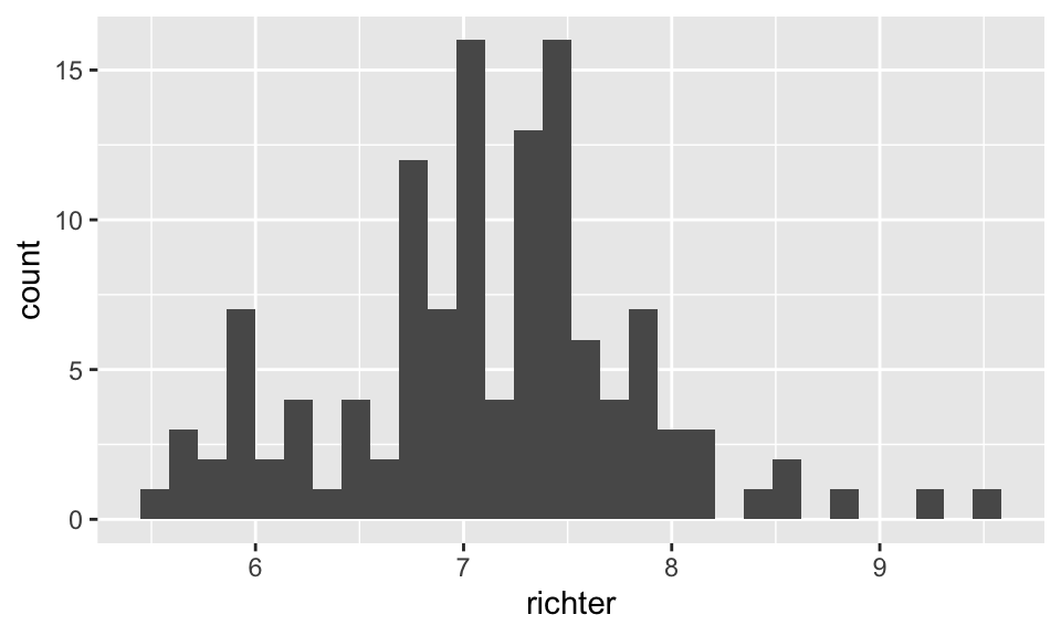
Add color and axis labels
ggplot(data = df) +
  geom_histogram(aes(x=richter),bins = 20,col="blue",fill="yellow") +
  ggtitle("Major 20th century Earthquakes") +
  xlab("Magnitude on the Ricther scale")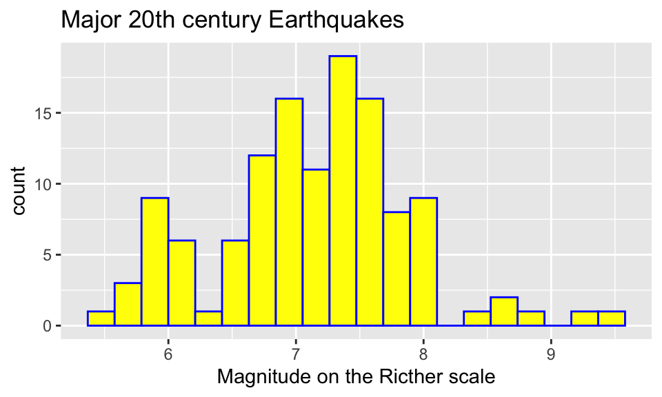
The col option colors the boundary of each bar, the
fill option colors the interior of each bar. If we want to
change the y-axis label, we add the layer
ylab("enter new label here inside quotes").
Specify the bins
Specifying the bins for a histogram is good practice. You can either
specify the bin widths with the binwidth option inside the
geom_histogram() command, or you can specify the total
number of bins with the bins option.
Using binwidth option
In the following graph, each bin has width 0.4.
ggplot(data = df) +
  geom_histogram(aes(x=richter),col="white",binwidth = 0.4)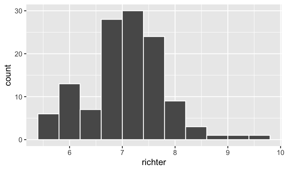
Using the bins option
In the following plot we create 16 equal width bins
ggplot(data = df) +
  geom_histogram(aes(x=richter),col="white",bins = 16)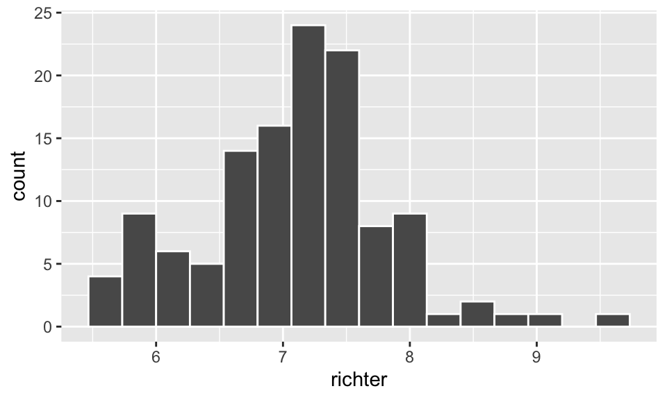
Add a vertical line to a histogram
We can add a vertical line layer to a plot with
geom_vline(). For instance, we may want to clearly mark in
a histogram the mean value of the data.
ggplot(data = df) +
  geom_histogram(aes(x=richter),col="white",fill="dodgerblue",bins=16)+
  geom_vline(aes(xintercept=mean(richter)),
             color="brown", linetype="dashed", size=1)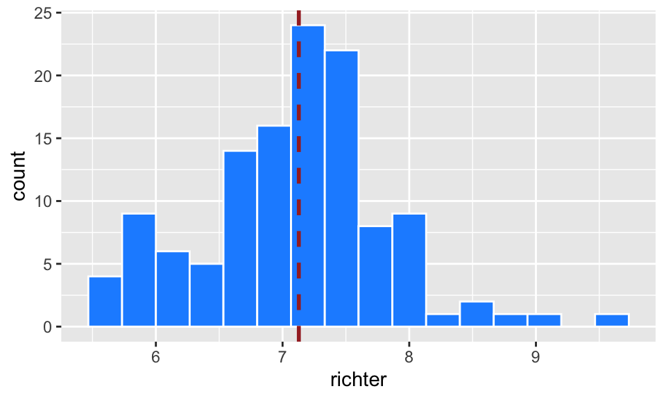
We can add non-vertical lines to plots as well, and go through this in the scatter plots section of this tutorial.
Change the theme
If you’re not a fan of the gray plot background, you can change the theme. Here are two other options:
ggplot(data=df)+
  geom_histogram(aes(x=richter),col="white",fill="steelblue",bins=10) +
  ggtitle("Major 20th century Earthquakes") +
  xlab("Magnitutde on the Richter scale")+
  theme_classic()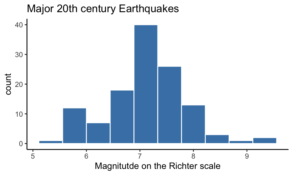
ggplot(data=df)+
  geom_histogram(aes(x=richter),col="white",fill="steelblue",bins=10) +
  ggtitle("Major 20th century Earthquakes") +
  xlab("Magnitutde on the Richter scale") +
  theme_bw()
Density Plots
Instead of a histogram of counts, we can produce a histogram of
relative frequencies by adding the option
aes(y = ..density..) as below. This will produce a
histogram that records the proportion of the values falling in each bin,
not the total counts.
ggplot(df) +
  geom_histogram(aes(x=richter,y = ..density..), bins=16, col="white", fill="dodgerblue",alpha = 0.4)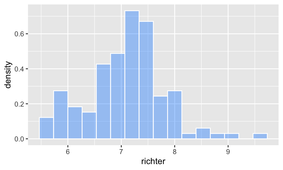
Note: The alpha option refers to the
opacity of the fill color. Values of alpha range from 0 to 1, with lower
values corresponding to more transparent colors.
Sketch a density curve
The geom_density() command gives an idealized density
curve rather than a histogram.
ggplot(df) +
  geom_density(aes(x=richter))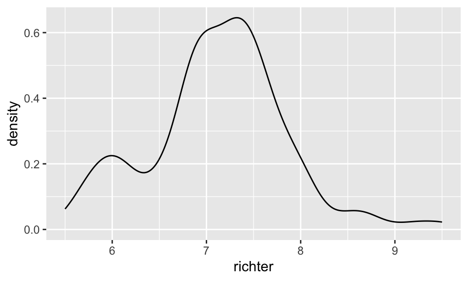
Scatter Plots with ggplot
Key layer: Use the
geom_point()plot type command, and specify x and y insideaes().
Basic scatter plot
Although there is likely no association, we can plot earthquake magnitude against the day of the month on which it occurred.
ggplot(data = df) +
  geom_point(aes(x=richter,y=day))
Add color and axis labels
ggplot(data = df) +
  geom_point(aes(x=richter,y=day),col="blue")+
  xlab("magnitude") +
  ylab("day of the month") +
  ggtitle("Major 20th Century Earthquakes") +
  theme_bw()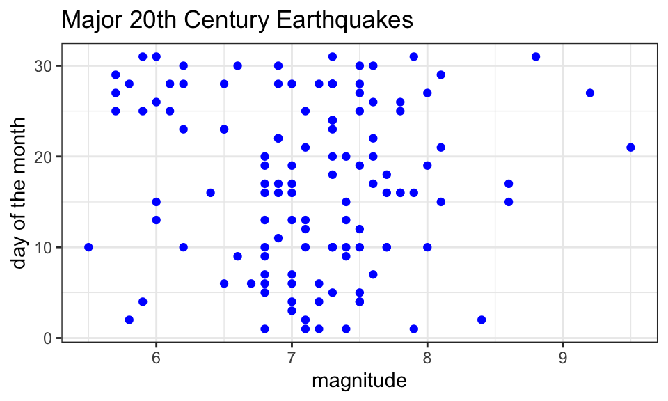
Notes:
- In this plot we specify the color (“blue”) outside the aesthetic.
This if fine if we want a single color for all the points. If we want
the color of a point to depend on some categorical variable, as in the
plot below, we specify that inside
aes().
- R has lots of built-in color names. You can see the names in RStudio
if you run
colors().
Add color by category
We can color points in a scatter plot according to a categorical variable by specifying col = this variable within the aes() command.
ggplot(data = df) +
  geom_point(aes(x=richter,y=day,col=month))+
  xlab("magnitude") +
  ylab("day of the month") +
  ggtitle("Major 20th Century Earthquakes")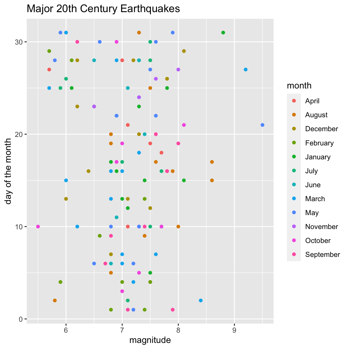
Bonus Round - Fit the line
We have two ways to add a line to a plot in ggplot.
Using geom_abline()
The first approach is to add the line by specifying the slope and
y-intercept using geom_abline(slope = , intercept = ).
For instance, the slope and \(y\)-intercept for the least squares line in
the faithful example are 20.227 and -0.4561, respectively (found by
using the code lm(day~richter,df)).
Knowing the slope and intercept values, we include the least-squares
line in a scatter plot by having two layers in our plot: - a
geom_point layer which plots the points, and = a
geom_abline layer which plots the line.
ggplot(data = df) +
  geom_point(aes(x=richter,y=day))+
  geom_abline(slope = -0.4561, intercept = 20.227)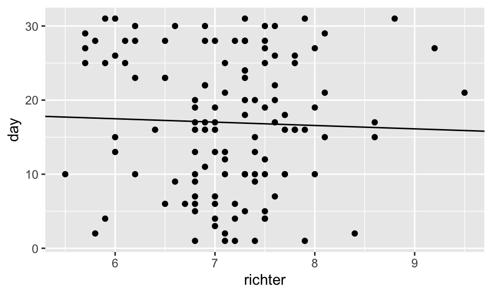
Note: We can change the size of the points
(size) and the thickness of the line
(linewidth), as well as the linetype (to
dashed, for instance), by adding these options to their respective
layers.
ggplot(data = df) +
  geom_point(aes(x=richter,y=day),size=.5)+
  geom_abline(slope = -0.4561, intercept = 20.227,col="blue",
              linetype = "dashed",
              linewidth = .7)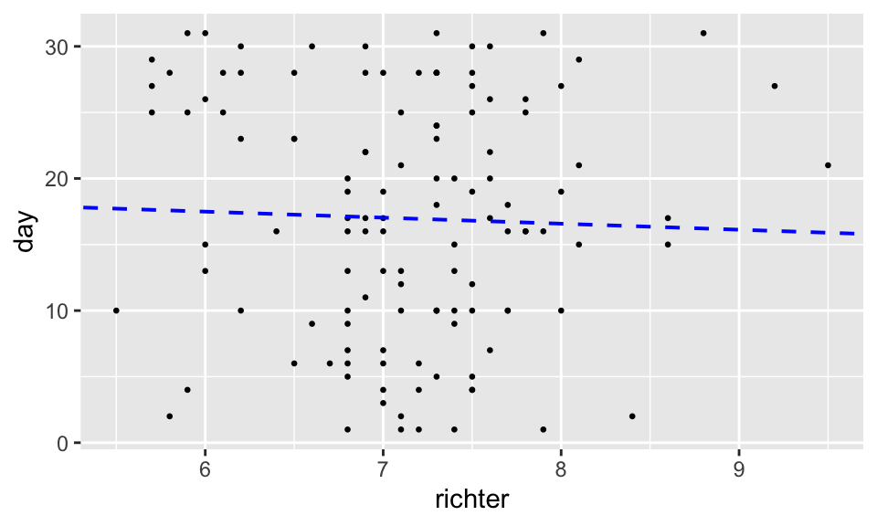
Using geom_smooth()
The second approach to fitting the least squares regression line to a
scatter plot is to use a geom_smooth() layer:
ggplot(data = df,aes(x=richter,y=day)) +
  geom_point(size = .5)+
  geom_smooth(method = 'lm',
              formula = y~x,
              se = FALSE) +
  theme_bw()
Note: Now the \(x\)
and \(y\) coordinates in the plot are
specified within the ggplot command since both the
geom_smooth and geom_point commands require
them. Alternatively, we could have indicated them in both layers.
Box plots with ggplot
Basic box plot
Key layer command:
geom_boxplot()
ggplot(data = df) +
  geom_boxplot(aes(x=richter)) +
  xlab("magnitude") +
  ggtitle("Major 20th century earthquakes")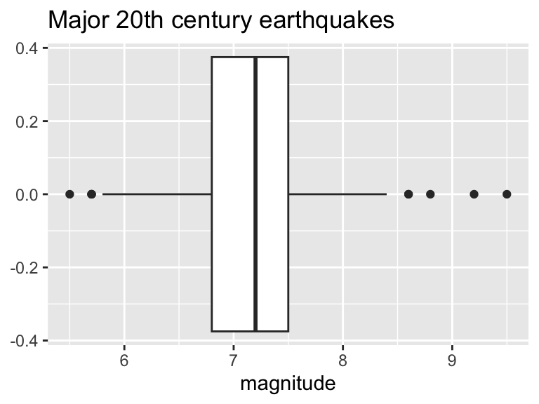
This plot is unsatisfying because it gives values on the y-axis, which are meaningless in the context of this box plot. We can hide them:
ggplot(data = df) +
  geom_boxplot(aes(x=richter)) +
  xlab("Magnitude") +
  ggtitle("Major 20th century earthquakes")+
  theme(axis.ticks.y = element_blank(),
        axis.text.y = element_blank())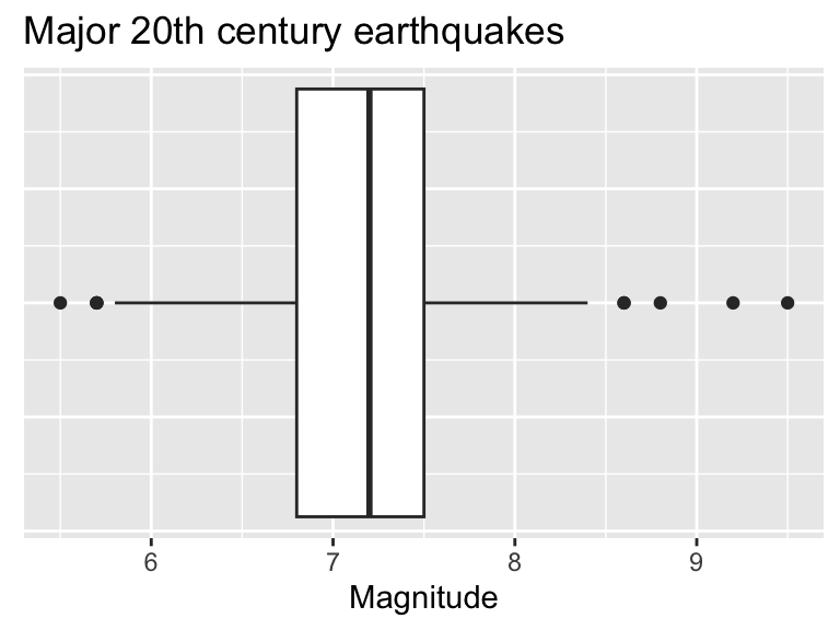
Add points to box plots
ggplot(data = df) +
  geom_boxplot(aes(x=richter)) +
  geom_jitter(aes(x=richter,y=0),col="seagreen",height=.1,size=1.2)+
  xlab("Magnitude") +
  ylab("")+
  ggtitle("Major 20th century earthquakes")+
  theme(axis.ticks.y = element_blank(),
        axis.text.y = element_blank())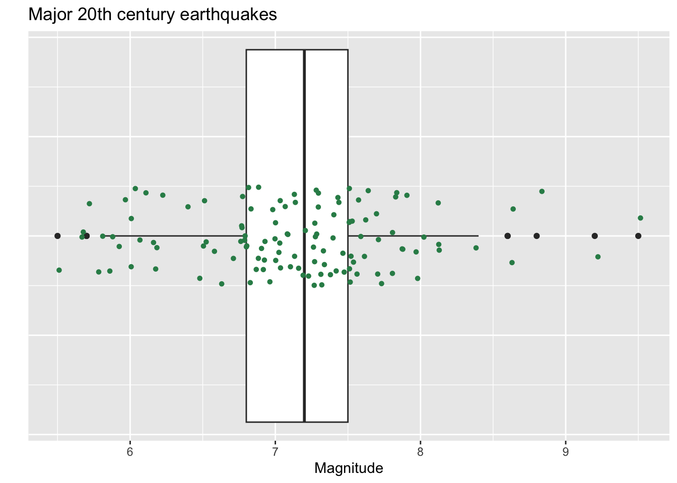
Note: The geom_jitter() command is the
same as the geom_point() with the exception that the
computer randomly moves the points a tiny bit (a little “jitter”). This
feature is a nice way to see multiple points that might otherwise be
stacked right on top of one another. The height=.1 option
in the geom_jitter layer means I’m letting the y-coordinate
of the point (the height) vary plus or minus .1 units from its actual
value.
Side-by-side box plots
ggplot loves to make side-by-side box plots from a data frame that has at least one numeric variable and one categorical variable.
Say we want to compare earthquake magnitudes (which is numeric) by month (which is categorical)!
ggplot(data = df) +
  geom_boxplot(aes(x=richter,y=month)) +
  xlab("magnitude") +
  ylab("month") +
  ggtitle("Major 20th century earthquake magnitudes, by month")
Notes on plot code:
- In the data frame
df,richteris numeric, andmonthis categorical. - Setting
x=richterandy=monthinside thegeom_boxplot()aestheic groups the data bymonthand produces a box plot of earthquake magnitudes for each month inmonth. - We can run the box plots vertically if we switch the roles of \(x\) and \(y\):
ggplot(data = df) +
  geom_boxplot(aes(x=month, y=richter)) +
  xlab("month") +
  ylab("magnitude") +
  ggtitle("Major 20th century earthquake magnitudes, by month")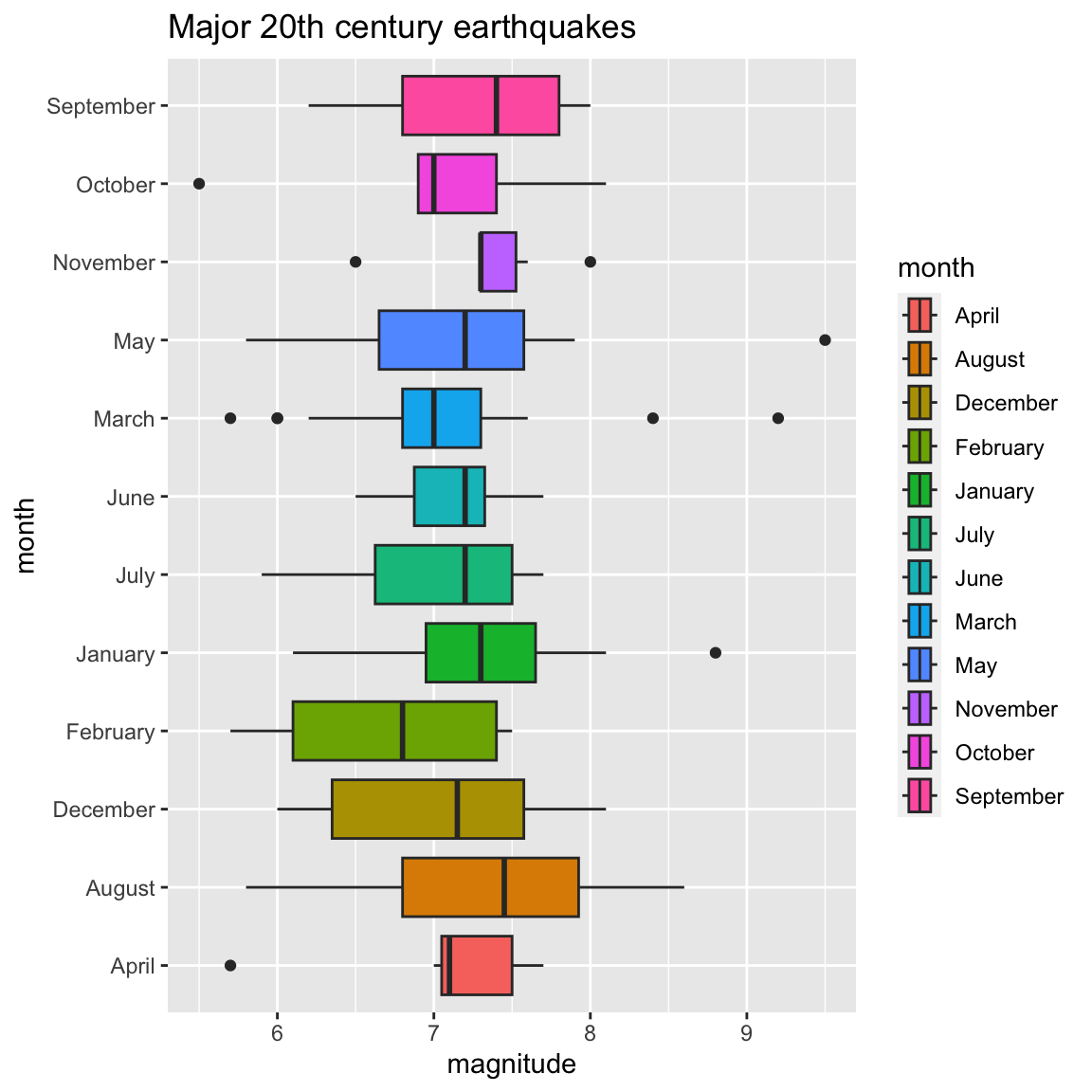
Coloring box plots
We can fill box plots with color according to a categorical variable
using the fill option.
ggplot(data = df) +
  geom_boxplot(aes(x=richter,y=month,fill=month)) +
  xlab("magnitude") +
  ylab("month") +
  ggtitle("Major 20th century earthquakes")
Ordering months chronologically
The first line of code below redefines the month column in a way that specifies the months in the correct order.
We can also hide the legend if it is superfluous, as
it is in this case, by adding show.legend = FALSE inside
the geom_boxplot() command.
df$month = factor(df$month, levels=month.name)
ggplot(data = df) +
  geom_boxplot(aes(x=richter,y=month,fill=month),show.legend=FALSE) +
  xlab("magnitude") +
  ylab("month") +
  ggtitle("Major 20th century earthquakes")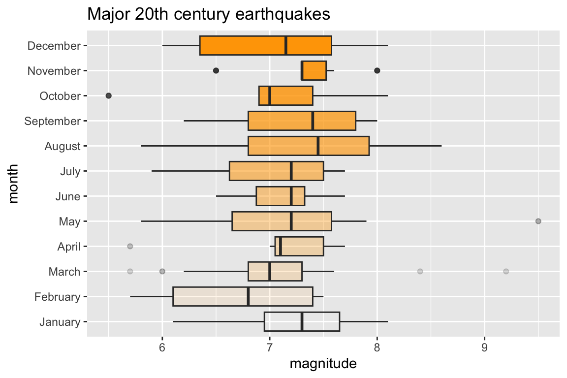
Bonus Round - Color Opacity
As mentioned in the histogram section, the alpha option
adjusts the opacity of a color in a plot. The closer alpha is to 0, the
more transparent it becomes, and the closer to 1, the more opaque it
becomes. In the graph below the three box plots are all filled with the
color “orange” but with different alpha values.
ggplot(data = df) +
  geom_boxplot(aes(x=richter,y=month),fill="orange",alpha=seq(from=0,to=1,by=1/11),show.legend=FALSE) +
  xlab("magnitude") +
  ylab("month") +
  ggtitle("Major 20th century earthquakes")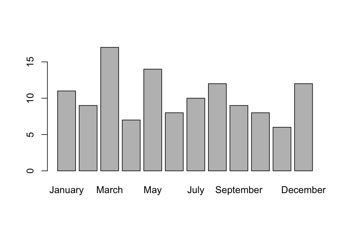
Bar plot for a categorical variable
In Base R we can visualize the frequencies for a categorical variable as follows:
barplot(table(df$month))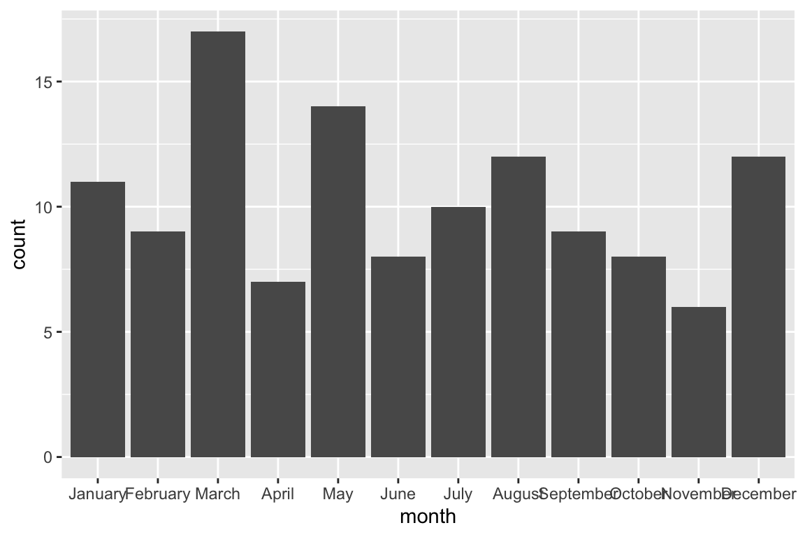
We can also create a bar plot with gglplot with the following code:
ggplot(data=df,aes(x=month))+
  geom_bar(stat="count")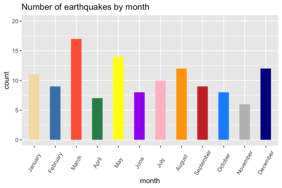
Note: We can specify colors manually, change bar width, add labels, and even rotate them so they look less crowded. We can also specify the limits of the values on the y-axis to be, say, 0 to 20:
colors=c("wheat","steelblue","tomato","seagreen","yellow","purple",
         "pink","orange","brown3","dodgerblue","gray","darkblue")
ggplot(data=df,aes(x=month))+
  geom_bar(stat="count", width=.5, fill=colors)+
  ylim(0,20)+
  ggtitle("Number of earthquakes by month")+
  theme(axis.text.x=element_text(angle=60,vjust=.5))
Cheat Sheet
The following page has a downloadable ggplot cheat sheet (pdf)